
How to Design an E-commerce Homepage for Better Conversions
Learn how to improve e-commerce conversions with better homepage banners, product collections, concern-based recommendations, and clear navigation.

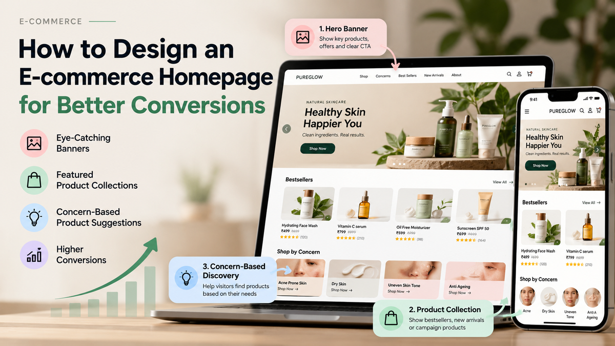
An e-commerce homepage is more than a place to display products. It is the starting point of the shopping journey, where visitors decide what to explore, which products to consider, and whether the store meets their needs.
When designing a homepage, I focus on one important question: can a visitor find the right product without unnecessary effort? A clear layout, relevant product suggestions, and easy navigation can make the difference between a visitor who leaves and one who completes a purchase.
Here are the key elements I would prioritise when designing an e-commerce homepage for better conversion rates.
1. Show the Right Banner Above the Fold
The first screen of your homepage deserves special attention. Visitors should immediately understand what your brand sells and which products or offers deserve their attention. Keep the main banner visible on the initial page load, ideally alongside a clear headline and a strong call to action.
- Highlight existing hero products, new launches, or important campaigns.
- Use a clear CTA such as "Shop Now", "Explore Products", or "Discover the Collection".
- Optimise banner dimensions and file sizes so the page loads quickly on mobile and desktop.
Pro Tip: Do not make visitors scroll to understand what you sell. Test whether your main banner communicates the product, its value, and the next action within the first screen.
2. Display a Product Collection in the Second Section
After the main banner, help visitors move directly into shopping. A featured collection is a practical second section because it connects the campaign message with actual products. Instead of filling the homepage with multiple promotional banners, show a relevant selection of products that visitors can explore immediately.
- Feature bestsellers, new arrivals, or products associated with the main campaign.
- Show product images, names, prices, and relevant offer details clearly.
- Include a "View All" link so shoppers can browse the complete collection.
Pro Tip: If your banner promotes a new product range, use the next section to display products from that range. This creates a natural journey from product discovery to product selection.
3. Build a Concern-Based Product Discovery Section
Not every visitor arrives knowing which product they want. This is especially common with organic search and direct traffic. Someone may visit a skincare or haircare store because they have a specific problem to solve rather than because they already know a product name.
Concern-based navigation helps visitors identify relevant products by starting with their needs. Instead of asking shoppers to understand your entire catalogue, help them find a suitable category based on the concern they want to address.
- Group products by customer concerns, such as hair fall, frizz, dryness, acne, or uneven skin tone, where relevant to your catalogue.
- Use simple category cards with clear labels and recognisable visuals.
- Link each concern to a curated collection or a useful product discovery page.
Pro Tip: Make concern-based discovery prominent on the homepage, particularly when organic and direct visitors contribute a meaningful share of traffic. Ensure each recommendation is relevant to the concern and supported by accurate product information.
4. Design for Organic and Direct Traffic
Visitors arriving from Google or typing your website address directly may have different levels of product awareness. Some already know your brand, while others are discovering your products for the first time. Your homepage should accommodate both groups instead of assuming every visitor has the same intention.
- Help new visitors understand your product categories and what makes your range relevant.
- Make shopping by concern, category, or product type easy to find.
- Give returning visitors quick access to popular collections and familiar products.
Note: Organic and direct traffic are not identical. Use analytics and landing-page reports to understand which pages these visitors enter through and whether they discover products or leave without engaging.
5. Keep Navigation Simple and Product-Focused
A homepage can contain excellent products and still perform poorly if visitors cannot find them. Clear navigation reduces the effort required to move between collections, product pages, and important shopping information.
- Organise the menu around meaningful categories and customer needs.
- Keep search, account, and cart icons easy to identify, especially on mobile.
- Avoid overcrowding the navigation with too many competing links.
Pro Tip: Review your website on a mobile phone before finalising the design. Make sure visitors can open the menu, find a relevant collection, and reach a product page without confusion.
6. Make Product Cards Easy to Understand
Once visitors reach a collection, product cards should help them compare options quickly. Missing prices, unclear product names, or inconsistent imagery can create friction and delay product selection.
- Use clear, consistent product images and readable product names.
- Display prices, relevant discounts, ratings, or key product details when available.
- Make product images and titles easy to tap on mobile devices.
Pro Tip: For a store with several similar products, include concise differentiators such as product type, primary use, or size. Help shoppers understand the differences without forcing them to open every product page.
7. Prioritise Mobile Speed and Usability
Homepage design is not just about appearance. Large banners, heavy animations, and unnecessary scripts can slow down the shopping experience. A visually impressive page that loads slowly may create more friction than it removes.
- Compress images and use appropriately sized responsive assets.
- Keep important content and shopping actions accessible on smaller screens.
- Review Core Web Vitals and real-user performance data to identify issues.
Pro Tip: Test the homepage on an actual mobile device and a typical mobile network. Check whether the hero banner loads properly, product cards appear quickly, and the main shopping actions remain easy to use.
8. Measure What Actually Improves Conversion
A homepage redesign should be evaluated through customer behaviour, not just visual preference. Track whether visitors discover products more easily and whether the changes contribute to better shopping outcomes.
- Monitor product-listing clicks, product-detail views, add-to-cart events, and purchases.
- Compare conversion rates across relevant traffic sources and device types.
- Run controlled A/B tests on major changes, such as banner messaging, section order, or concern-based discovery.
Note: A higher click-through rate does not automatically mean higher revenue. Evaluate the full journey, including add-to-cart rate, checkout completion, and purchase conversion, before deciding whether a change is successful.
Final Thoughts
A conversion-focused e-commerce homepage should guide visitors from discovery to product selection with as little friction as possible. Start with a relevant hero banner, follow it with a featured product collection, and make concern-based recommendations easy to discover. Then improve navigation, mobile performance, and product presentation using real customer behaviour.
Your next step: Review your homepage on mobile and desktop. Check what visitors see on the first screen, what appears in the second section, and how quickly they can find a product that matches their needs. Prioritise one improvement, measure its impact, and build from there.